Geek. Heaven.
Wow.
Google SketchUp is way too much fun for its own good. Why spend half an hour creating a basic floor plan with a pencil and paper when you can while away much of the day creating a three-dimensional model?
One way or another, it had to be done. I wasn't able to sign the contract and get the key today, but I do have an actual appointment to do so tomorrow. Early tomorrow.
In the meantime, I got permission to go in and measure the rooms because, people? This is a tiny apartment. The total dimensions are about 15.5 x 26.5 feet (that's 410 square feet).
It's tiny enough that I wasn't sure all my furniture would fit - and, indeed, it won't. Measuring the rooms and the furniture is way preferable to paying somebody to move my stuff, and then not being able to use it, and having to then pay somebody to take some of it back again.
My sewing table is made from a full 4x8-foot piece of ... whatever it's called. Masonite, maybe? Anyway, it's huge, and while it would technically fit in either the living room or the bedroom, it would be the only item I could put in whichever room, leaving the other to hold...well, more than it would be able to hold.
So I've opted for a much smaller sewing space - the top of my desk, to be shared with the computer - but the comfort of having a couch in the living room, a bookcase (or two) in the bedroom, and enough space to actually move around in any given room.
The white spaces on the floor in the graphic below are ... something I don't know the name for. I call them "vertical skylights" - they're little shafts of outdoors that run down through the place, with windows onto them, but no access. Well, I guess the downstairs apartment probably has access, but for me they're just light sources.
The space in the back there is a little utility space - laundry sink, hookup for a washing machine. I put the fridge there to save space in the kitchen, but it fits in either spot - we'll see where it actually ends up.
The big - well, okay - the tiny empty space behind the couch is the bathroom. It's L-shaped, with the shower in the space behind the skylight thingy.
The empty space between the two bedrooms is a built-in closet in each room and the "hall" created by the two doors, which face each other as opposed to opening directly onto the living room.
The front door is front and center, to the left of the desk there.
There are windows in the living room and the front bedroom (which is why I'm thinking about keeping the bunk beds toward the center of the room). The back bedroom has windows too, onto the skylight thingy and onto the utility room, so every room has an impressive amount of natural light for a space that is actually walled in on three sides.
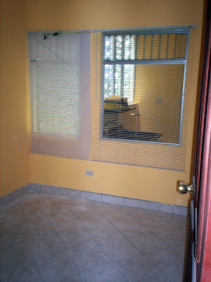
Oh, and here are some photos for those of you interested in that sort of thing ;)


5 comments:
well...the colors are nice. i like that blue and that yellow together. did you get to pick and paint yourself? makes it seem less tiny.
(i have to catch up at your blog here...i have missed a lot i can see)
I really like those colors! And I know you know this, but I love to say it,well write it....in real estate parlance, it's cozy (not small).
And how clever you are to measure! I need to learn how to be more methodical like that. It would save me a whole bunch of trouble.
It's totally cozy.
And no, I didn't get to pick the colors - I just totally lucked into an apartment owned by someone who wants it to look really nice.
And it does look nice. I've always wanted an accent wall :)
i've always wanted an accent. Maybe Cuban.
the place looks great
That's a really well thought-out space. The owner (or somebody) did a great job of making a little place really habitable, and cute as well!
Good luck with the fitting-in process. I'll bet, by the thought you're putting into it, that you'll do just fine there.
Peace and Hope, Ralph
Post a Comment